9.07.2016

Furniture that tickles your brain — exhibition with HDK students


From left to right: Lebe by Anton Ebel, 120° by Anna Spaak, Connesso by Caroline Eriksson. Photo: Frida Berntson. 

Together is a furniture exhibition with students from the Academy of Design and Crafts, University of Gothenburg at the student gallery space A-venue in the heart of Gothenburg. The ten students exhibiting attended the course ”Design as carrier of value” and created objects that were interpreted by the theme ”together” in different ways. The complexity of being together and how it affects us is shown in the exhibition by the very different and creative furniture.

Unity by Elin Wall. Photo: Frida Berntson.
Video explaining how you can rearrange Unity. Photo: Frida Berntson

Most of the objects were different chairs or benches with or without conjoined tables, but there were also types of storage furniture and so on. An evident theme among most of the objects was the ability to interact with them in different ways; to disassemble them and arrange them differently or make it look different with your own body.

The wooden bench ”Lav” made by Sara Bergqvist was one of the objects I found very interesting and beautiful. Made in light wood the bench is in the process of being taken over by a blue-grayish lichen (made of felt). The organic and winding forms make you want to interact and touch the felt, and also explore it; might there be something underneath? I remember looking at the bench and wondering if you’re supposed to touch it or even sit directly on top of the added felt ”flowers”, but after reading the description provided by the artist I understood that interaction was a part of the experience. Before seeing this exhibition I rarely thought about furniture that could make you feel something or make you interact with it in other ways than sitting on it or using it for the ”obvious” purpose.


Lav by Sara Bergqvist. Photo: Frida Berntson

Another object that focused more on raw materials and the combination of them was the stool "Vesuvio" by Nils Bengtsson Blomstrand. The contrast of the raw-looking metallic material and crisp wood was interesting and also the burnt detail on the legs. There was a video showing the process of making the stool and the stages the materials went through which was very interesting.
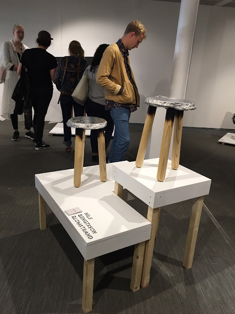

Vesuvio by Nils Bengtsson Blomstrand. Photo: Frida Berntson.

The organization of the exhibition was great, a little brochure with information about the designers and objects was provided and every designer had a business card designed in the same theme as the exhibition itself. One teeny tiny thing I would've liked to see was the used materials clearly written in the brochure, with furniture I find it’s even more interesting and important to focus on material and why designers use certain materials, especially in today’s day and age. The exhibition was a great experience and I highly recommend you go and see it!


The opening night August 31st. Photo: Frida Berntson


The exhibition is open until September 17th and you can find more information here

8.09.2016

Yayoi Kusama at Moderna Museet in Stockholm

Outside the entrance to Moderna Museet in Stockholm. Photo: Frida Berntson

The Exhibition In Infinity with artist Yayoi Kusama has been touring Scandinavian modern art museums for a year or two, so I was very happy to be able to travel to Stockholm and experience it at Moderna Museet last week. Before coming to the museum I didn't know how multifaceted and broad Kusama's artistry is; coming from post-war Japan and working in New York in the 1960's with other famous artists to still being active today creating fascinating and challenging art. The exhibition was consistent and showed every period of Kusama's artistry, from her earliest work in gauche and silk in Japan to her bigger installations and sculptures from the 1980's and 90's. Paintings, footage from happenings in New York, fashion, sculptures, installations, pictures, letters, magazines, a movie and more was shown at the exhibition. This can seem very overwhelming for the viewer, I felt the contrary; finally an exhibition that shows the whole picture of an artist's work, life and context.

Artworks were even placed in the lobby. Photo: Frida Berntson

Introduction to the exhibition in the lobby. Photo: Frida Berntson

In Infinity is organized by the Louisiana Museum of Modern Art in Denmark in association with the bigger modern art museums in Scandinavia, it is curated by Louisiana. At Moderna Museet the exhibition consisted of three parts, an introduction in the lobby and then two different areas in the museum. This was mildly confusing as a viewer, but it was also kind of nice with a little break from the art and then going into the rest of the show. Kusama's art was shown in chronological order and the last part was a lot about her life and background.

The first room with recent paintings by Kusama. Photo: Frida Berntson

Detail of No. B White, 1959, oil on canvas. Photo: Frida Berntson

In the third room of the exhibition you start to recognize Kusama's famous polka dots in paintings, and one that stood out to me was the painting No. B White. The dotted pattern is textured by the oil paint in this painting and creates a lively energetic repetition; you can clearly see the impression from the flick of the brush. And with the painting being white the texture comes forward even more which makes this painting also about space. 

Inside the room and installation Infinity Mirror Room - Phalli's Field. Selfie: Frida Berntson

Going further into the exhibition you come across Kusama's interactive room installations, the exhibition had a few(!) and one of them was the Infinity Mirror Room - Phalli’s Field. You simply walk through a door and are consumed by art on all sides and with the help of mirrors an infinite landscape is created. This particular installation was a field of white little phallic shapes covered in red dots. I always appreciate when art is interactive and you can move around, feel and almost be the art. The infinity rooms are like that, and I don't think anyone comes out feeling nothing. I felt a mixture of being trapped and floating in an infinite landscape; a strange and wonderful feeling.


A look inside the installation Mirror Room (Pumpkin), 1991. Photo: Frida Berntson

The installation Dots Obsession, 2016. Photo: Frida Berntson

Photo from the Brooklyn Bridge Happening, 1968. Photo: Frida Berntson

Perhaps the most exciting room in the exhibition was the room that showed film clips and pictures from Kusama's art happenings in New York in the 1960's. The pictures were shown on slide projectors across the room, and you could sit down and watch them. The happenings were about sexual liberation and political protest and were held all across New York; on Wall Street, in Central Park and on the Brooklyn Bridge. People wore clothes designed by Kusama at the happenings and to protest against the establishment they sometimes removed the clothes. Kusama then proceeded with painting their bodies in dots and declaring herself the "Priestess of Polka Dots". The clothes Kusama designed was an important part of her art activism and a social commentary aimed at promoting gender equality and a more natural attitude to the naked body. While seeing the pictures and clips you quickly realize that an art happening like this wouldn't be allowed today, or the artist and participants would likely be carried away by police very quickly. It makes you think about how the establishment today treats public art and protests...


Orgy Dress, 2000, cotton fabric in the pattern Stars/YAYOI KUSAMA Furniture by graf: decorative mode no.3. Photo: Frida Berntson

In Infinity is probably the best curated exhibition I have ever had the pleasure to experience. So much useful information about Yayoi Kusama's life and art was provided to the viewer and it was easy to understand why every room was focused on a certain thing. There were few guards at the venue which made the experience relaxed and enjoyable. I also think the exhibition was great for all ages, small children as well as older visitors were thoroughly enjoying themselves. Kusama's art is such a wonderful thing as comprehensible, complex and difficult to understand at the same time.

To find out more about this exhibition visit Moderna Museet's webpage http://www.modernamuseet.se, the show goes on until September 11, 2016.

Narcissus Garden, 1966/2016, orbs in stainless steel. Photo: Frida Berntson

7.19.2016

Rest your little head and tell me about the past - first show at reopened Culture Center in Alingsås

The Culture Center in Alingsås has been closed for renovation for a while; in June it reopened with a remodeled art space and library. There are sadly few art spaces and galleries in the little town of Alingsås, but there are some institutions that have exhibitions with mostly local artists, and I hope that the reopened art gallery at the Culture Center will pursue work like that and maybe open up for international artists. With the new gallery being bigger I hope that more focus can be put on art in Alingsås in the future.

The first exhibition to open in the new space is called Rest your little head and tell me about the past by artist Patrik Bengtsson. Bengtsson is living in the southern archipelago of Gothenburg and has had exhibitions in Sweden and Europe. The exhibition is composed of three different parts, and it might even be accurate to call the work an installation. The most prominent part of the exhibition is the 1:1 scale Brontosaurus sculpture made out of fabric that is laying on the ground with a big fluffy pillow under its head. The wall to the right of the Brontosaurus is decorated with a motif from space, and on the other wall to the left is a kind of speaker-system installed. The sound coming from the round speakers is a sort of low humming which really sets the mood in the gallery. Behind the same wall is a sort of mini-installation with different materials in a pattern.

The life-size Brontosaurus by artist Patrik Bengtsson. Photo: Frida Berntson

The sign reads "Be careful, the sculpture is fragile, but gentle petting is okay." Photo: Frida Berntson

Bengtsson’s installation is about history, truth and storytelling. The Brontosaurus is signifying all of that with its existence being questioned and the story of its origin being changed throughout the past centuries. The humming sound from the speakers is actually re-edited famous speeches from youtube videos. You start to contemplate the very concept of time after a while, the contrast between the Brontosaurus and speeches of politicians is stark. You also realize that it is important to sometimes stop and think about the truths of the past, which I think is the main message of the entire exhibition.

The information that was provided on the wall at the exhibition. Photo: Frida Berntson

Wall installation by Patrik Bengtsson. Photo: Frida Berntson

The wall with the speakers. Photo: Frida Berntson


The exhibition was dynamic with the focus on space and form, but I can’t deny the lack of information that was provided by the gallery. A paragraph of text was placed on the wall but the information was vague and nothing was said about the artist, style influences, materials or anything like that. For an exhibition with this type of existential theme I think it would be necessary with enough information so the visitor can move around the installation and understand the pattern. When I was walking around the space I was a little confused, wondering what everything really meant. There were some papers with more information at the venue but it was organized as long essays, which is not that approachable for the average viewer. I did really like the sign in front of the Brontosaurus though, and the exhibition is excellent for children. Of course you can make the installation your own, without information, but since the artist had a special message I think more accessible information should have been provided.


You can find information about the new Culture Center and exhibition here, sadly only in Swedish.

5.01.2016

Art and Media Activism in the Bay Area

Information at the entrance of Take This Hammer at the YBCA. Photo: Frida Berntson, April 24, 2016.

Art and activism; two concepts that often go hand in hand in today’s art world, it’s hard to even think of art that isn’t in some way politically or socially loaded. So what does art activism look like today? And how has activism changed with social media, huge corporations, hashtags and profile pictures? These questions and more are covered in the exhibition Take This Hammer – Art + Media Activism from the Bay Area currently open at the Yerba Buena Center for the Arts in San Francisco.

The curator of the show, Christian L. Frock, is an independent curator, writer and educator and focuses her work on art and politics. In the very informative show brochure Deborah Cullinan, CEO, talks about how the mission of YBCA is to express culture that moves people, and that cultural movement is the essential element for change. Take This Hammer really expresses that statement; as a voice of the people.

The Exhibition space of Take This Hammer at the YBCA. Photo: Frida Berntson, April 24, 2016

The exhibition space was large and open, with smaller rooms and a big central room for bigger works. The first thing you see when entering the exhibition is a huge installation of posters by the graphic arts collaboration Dignidad Rebelde. Their prints are about Chicana feminism and indigenous people’s rights to confront power. Every poster declared an issue and a call for action. My favorite poster was one that declared how Oakland is occupied land and belongs to the Ohlone Native Americans. I can relate to this a little bit since I wrote a research paper about the Ohlone people in a history of California class that I took at Santa Monica College. I think anyone can relate in some way to any of the posters.

Dignidad Rebelde, Selected works, 2007-15, seventy screen prints, fifteen digital prints, and one offset print. Photo: Frida Berntson, April 24, 2016.

Detail, Dignidad Rebelde, Selected works, 2007-15, seventy screen prints, fifteen digital prints, and one offset print. Photo: Frida Berntson, April 24, 2016.

Some artworks were hard to experience, they showed how exposed Hispanic and African American people are in the Bay Area. They might be victims of possible eviction due to gentrification, or more likely to experience police brutality. The two interactive artworks by the Anti-Eviction Mapping Project showed different maps where you could acquire data about how ethnic groups have moved from different places in the city, how public space has been reduced and data about how many people of different ethnic groups are victims of police brutality by the SFPD and OPD. The artwork is simple but powerful, it is hard to experience this horrible data. One can think that the rational format makes it impersonal, but the added pictures of victims of police brutality make it both personal and real.

Anti-Eviction Mapping Project, Compilation of Maps: Ellis Act Eviction Map, No-Fault Eviction Map, Loss of Public Space Map, Map of Killings by the SFPD and OPD, 2016, Video, color, 24:59 min. Photo: Frida Berntson, April 24, 2016

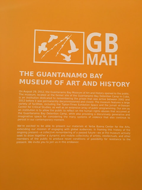
The whole exhibition is also about social issues of the past, present and future. In one corner of the exhibition was the innovative installation The Guantanamo Bay Museum of Art and History by The Walter Benjamin Memorial Gallery. The installation showed information about a newly opened museum at Guantanamo Bay after it was closed in 2012. You could read on the posters how the museum was dedicated to remembering the awful human rights abuses that took place there and that the institution focused on public discussion. The installation is showing a utopian present where President Obama kept his word and shut down the infamous institution. This artwork shows another present and a future that we maybe can try and accomplish.

The exhibition was very dynamic, with different types of media and showing local artists, all very positive factors. One thing that could have made the experience even better was if the show was more interactive since it was about activism.

The Walter Benjamin Memorial Gallery, The Guantanamo Bay Museum of Art and History, 2016, Mixed-media Installation. Photo: Frida Berntson, April 24, 2016

The Walter Benjamin Memorial Gallery, The Guantanamo Bay Museum of Art and History, 2016, Mixed-media Installation. Photo: Frida Berntson, April 24, 2016

Take This Hammer leaves you angry, dejected and even sad; suddenly this world of inequality opens up in front of you through art, which makes the impact even more powerful. But the exhibition also gives you strength and power to change. With artists working with this, inspiring and hoping for a better future, it really catches onto you.

Me in front of the artwork Blackout by Indira Allegra, 2015, Six-channel video, black and white, 1:30 min. Photo: Tone Persdotter, April 24, 2016

4.24.2016

Aftershock – lecture about the Art Hotel with organizers and artists

Art Hotel organizers speaking at the lecture. Photo: Frida Berntson, 042016

Some of you might remember the blog post I did a while back about the ”Art Hotel” in downtown Sacramento. This fantastic happening was probably the strongest art experience I’ve ever had, and I don’t think I’m the only one feeling that. With 13,000 visitors and 20,000 wanting to get in but couldn’t, I think it is safe to say that the Art Hotel was an incredible success! I’m not from Sacramento and not even from the US, but I think I’m on the right track when I think the Art Hotel was probably the most influential art show in Sacramento in years. It has already become legendary. On April 20th Art Hotel organizers Seumas Coutts, Ph.D. and Shaun Burner as well as a few Art Hotel-artists had a lecture at Sac State about the Art Hotel and its impact on Sacramento.

The underlying message during the lecture was how the organizers wanted art to be experienced, they wanted and had free admission; they wanted to achieve total inclusivity, and they wanted the art experience and community to be most important. The Art Hotel created a space where people just experienced art; it wasn’t held in a big institution that could influence the experience, and there wasn’t a “right way” to display the art at the Art Hotel, art was everywhere, unlabeled and raw. This made it feel genuine and artist-to-viewer centered; it turned into a dialogue where the art could speak for itself.

The Art Hotel was also about the major “high culture” institutions versus grassroot organizations. Something Seumas Coutts mentioned a few times is how art is always stressed to be good for the economy, and therefore is accepted to get funded, but what about the thought that art might be good for people, the city? This thought was one of the key elements in the organization of the Art Hotel. They were funded by a kickstarter campaign, and all of the about 130 artists that participated knew that they wouldn’t get any other payment, but they believed in the project and worked together. There was a financial risk, and a risk of failure that everyone was aware of, but every single artist and organizer worked hard to make this happen and to get the word out. The Art Hotel turned into an art community, an art community that almost every artist at the lecture thought was really needed in Sacramento. Many of them mentioned how the art community and the different institutions are competing with each other more than collaborating, and the need to change that.

A moving story that one of the artists told us about was how a single-mother with three kids came to see the show from Folsom (suburb of Sacramento), and that with a possible admission fee, she would probably not have been able to attend the show. This was something that the organizers were very passionate about. Art should be accessible to everyone, no matter what situation or occupation you might have. This is a discussion we have had in Sweden for a long time. It is generally very cheap to visit museums in Sweden, but the fees has gone up in recent years, and I think this can function as a reminder for us to stick with our values and keep the museums accessible for everyone! Right now museums in Gothenburg are free until you’re 25 years old, everyone else can buy a ticket for $5 that is valid for a year and you get free access to all public museums in Gothenburg.

The group responsible for the Art Hotel; M5 Arts, is now planning their next project which is going to be a lot bigger. According to Seumas Coutts they will open the first Sacramento Biennale in 2017. I will probably not be here then, which makes me very sad. But I will take the incredible inspiration with me back to Gothenburg, and I think that something like the Art Hotel could absolutely be made in Gothenburg. Gothenburgians; what do you think?

4.17.2016

Lecture at Sac State with curator Kendall H. Brown about Bidou Yamaguchi's Noh Masks

Traditional Noh masks by Bidou Yamaguchi. Photo: Frida Berntson, 04-13-16 

The Japanese Noh theater is a traditional theater in Japanese culture heavy with poem, includes music and dance and the stories are mainly about people seeing and dealing with ghosts from the past. Noh theater has been performed since the 14th century. Traditional costumes are worn by the actors as well as masks; specific masks that have a special look to them. Bidou Yamaguchi is one of few contemporary masters of mask carving in Japan, and he is also a pioneer since he is the first artist to go beyond the traditional norm and create non-traditional Noh masks. His masks are currently on display in the Sac State Library Gallery in the exhibition “Traditions Transfigured – The Noh Masks of Bidou Yamaguchi”, and on April 13 a lecture was held there with the curator Prof. Kendall H. Brown of California State University Long Beach.

Kendall H. Brown speaking, beside him the mask of Mona Lisa. Photo: Frida Berntson, 04-13-16

The curator started the lecture by telling the story of how the exhibition was made, which I thought was interesting. The exhibition was made in collaboration with graduate students at Cal State Long Beach, and the show was specifically done for universities. The exhibition had a lot of different elements like video, sound and an interactive part which the curator explained was the student’s idea. The interactive part consisted of a mirror and “toy” Noh masks that you could handle yourself and maybe take a “selfie”, which the curator thought was very amusing but also a great idea.

Mask depicting Vermeer's Girl with a Pearl Earring by Bidou Yamaguchi. Photo: Frida Berntson, 04-13-16
Mask depicting Munch's Madonna by Bidou Yamaguchi. Photo: Frida Berntson, 04-13-16

The exhibition was done in three parts; the first part with traditional masks and the art that inspired them, the second part with the new non-traditional masks, and the last and third part about the making of the masks. The first part is Yamaguchi’s day job, Brown explained. For several hundred years no new masks were made in Japan, the actors just kept using the traditional old ones. But of course that wasn’t sustainable, so new masks started to be made, and the new carvers copied the old masks. This can seem uncreative and boring to westerners, but Asia has a tradition of copying old masters, as in Chinese landscape painting for example, everyone copying make subtle changes which lead to new ideas. So the new mask artists learned how to age the masks; add little cracks all over the paint and make it look worn where the actors would hold it. So Noh mask carvers are also masters in aging techniques. One important thing that the curator pointed out is that Noh mask makers are not only carvers but also painters, they carve and paint their objects, so it is a truly dynamic work.

The second part of the exhibition was the most exciting with the new non-traditional masks; Bidou Yamaguchi started a series with famous European portraits of women. Masks of Mona Lisa, Botticelli’s Venus, Vermeer’s Girl with a Pearl Earring and Munch’s Madonna were displayed at the exhibition to name a few. When asked why the artist chose this subject the explanation was that he was simply drawn to their faces. These masks are however not simple appropriations; since the Noh play is about ghosts, the masks are considered to express the ghosts of the women, their spirits and their persona. Yamaguchi even re-created all the little oil paint-cracks that most of these paintings have, and according to the curator it took somewhere between eight to nine hours to create! All masks have the sophistication of the traditional ones, and the artist has expertly re-imagined legendary women of art history from 2D to 3D magic.

The process of carving a Noh mask, by Bidou Yamaguchi. Photo: Frida Berntson, 04-13-16

The third and last part of the exhibition was about the making of the masks and also about how the masks appear in different angles and light. Brown explained that the traditional mask “young lady” actually appears to change its expression in different angles and light. There was a video showing this where a robot turned the mask in different ways, and we could all see how the mask turned slightly sad, a little angry, or happy when the smile was accentuated.

The lecture was a very positive experience, the audience walked around in the exhibition and the curator talked about the different parts as we walked through it which is a different format than just sitting down before a slideshow. It is a very good format, it keeps your interest up and you are engaged in the art at the same time you learn everything about it.

The exhibition is on display at Sac State until May 21, 2016.

A video showing the masks from the Sac State Youtube channel.

4.03.2016

Art at Elliott Fouts Gallery

Sacramento has a large number of art galleries across the city, and many of them reside in the lively area of Midtown. Next to downtown, Midtown with its many restaurants, bars and graffiti murals amongst charming wooden houses and lots of trees is a dynamic and interesting neighborhood. No doubt galleries find this area exciting. Elliott Fouts Gallery, one of the galleries in Midtown, opened in 1999 but moved to Midtown in 2012. The gallery specializes in representational landscape and still life painting and has an exhibition space with monthly shows as well as a bigger area for the regular works for sale. Since the gallery was in the midst of changing exhibitions I saw a small portion of Timothy Mulligan’s work that was up in one part of the gallery, and the brand new exhibition of paintings by Lauren Pretorius in the main exhibition space.

Me in front of Timothy Mulligans art. Photo: Virginie, 04-02-16

Timothy Mulligan, Coastal Cliff View, Northern CA, 2015, acrylic on canvas. Photo: Frida Berntson, 04-02-16

Timothy Mulligan, Lake Boats, Tahoe, 2015, acrylic on canvas. Photo: Frida Berntson, 04-02-16

Detail from Timothy Mulligan, Lake Boats, Tahoe, 2015, acrylic on canvas. Photo: Frida Berntson, 04-02-16

Timothy Mulligan, Tiscornia Park, Sacramento, 2015, acrylic on canvas. Photo: Frida Berntson, 04-02-16


Timothy Mulligan’s work is essentially inspired by the French Impressionist movement but with elements of a more expressive style with simplified forms and clear, crisp colors. At first glance Mulligan’s art comes across as very colorful but maybe a little lifeless and overly structured with diagonals and lines crossing perfectly on the canvas. But as you look closely his paintings express a sharp texture that suits very well with the overall style, and the use of different techniques as etching into the wet paint and the absence of visible brushstrokes makes the paintings come together as a whole. Mulligan is a local artist educated at Sacramento State, and his motifs are landscapes around Sacramento and the Bay Area. In Sweden artists paint local landscapes in a very specific way to express the clear and kind of cold Scandinavian light, and to compare that to Mulligan’s warm toned Californian landscape was very interesting.


Lauren Pretorius's exhibition at Elloitt Fouts Gallery. Photo: Frida Berntson, 04-02-16

Lauren Pretorius, Cracked Egg, oil on panel. Photo: Frida Berntson, 04-02-16

Detail of Lauren Pretorius, PB&J Sandwich, oil on panel. Photo: Frida Berntson, 04-02-16

Lauren Pretorius, Spoonful of Honey, oil on panel. Photo: Frida Berntson, 04-02-16

Lauren Pretorius, Fresh Lemonade, oil on panel. Photo; Frida Berntson, 04-02-16


Lauren Pretorius’s show in the exhibition space was very different from Timothy Mulligan’s art. Pretorius’s work is in the still life tradition but with a modern twist with smaller square or rectangular canvases with different objects from everyday life; chopped vegetables, a cracked egg, a glass of lemonade, an onion, an avocado and my favorite – a peanut butter and jelly sandwich. The objects are beautifully modeled in a realistic manner in light and shadow. My initial thoughts from Pretorius’s art was that it is kind of dissecting the mundane in our lives and analyzing the objects we are so familiar with that we don’t notice them. For me as a foreigner some of the paintings made me think of the typical American daily life; especially the paintings with the lemonade, the honey bear, and the peanut butter and jelly sandwich. But for Americans it is probably just a depiction of mundane things.


It is interesting comparing galleries and museums; museums often have an admission fee, but you feel almost always welcome there, at this particular gallery you did not feel welcome at all, even though you didn’t have to pay to see the art. Maybe you could describe this situation as what type of space is welcoming you, a public space or private?