4.24.2016

Aftershock – lecture about the Art Hotel with organizers and artists

Art Hotel organizers speaking at the lecture. Photo: Frida Berntson, 042016

Some of you might remember the blog post I did a while back about the ”Art Hotel” in downtown Sacramento. This fantastic happening was probably the strongest art experience I’ve ever had, and I don’t think I’m the only one feeling that. With 13,000 visitors and 20,000 wanting to get in but couldn’t, I think it is safe to say that the Art Hotel was an incredible success! I’m not from Sacramento and not even from the US, but I think I’m on the right track when I think the Art Hotel was probably the most influential art show in Sacramento in years. It has already become legendary. On April 20th Art Hotel organizers Seumas Coutts, Ph.D. and Shaun Burner as well as a few Art Hotel-artists had a lecture at Sac State about the Art Hotel and its impact on Sacramento.

The underlying message during the lecture was how the organizers wanted art to be experienced, they wanted and had free admission; they wanted to achieve total inclusivity, and they wanted the art experience and community to be most important. The Art Hotel created a space where people just experienced art; it wasn’t held in a big institution that could influence the experience, and there wasn’t a “right way” to display the art at the Art Hotel, art was everywhere, unlabeled and raw. This made it feel genuine and artist-to-viewer centered; it turned into a dialogue where the art could speak for itself.

The Art Hotel was also about the major “high culture” institutions versus grassroot organizations. Something Seumas Coutts mentioned a few times is how art is always stressed to be good for the economy, and therefore is accepted to get funded, but what about the thought that art might be good for people, the city? This thought was one of the key elements in the organization of the Art Hotel. They were funded by a kickstarter campaign, and all of the about 130 artists that participated knew that they wouldn’t get any other payment, but they believed in the project and worked together. There was a financial risk, and a risk of failure that everyone was aware of, but every single artist and organizer worked hard to make this happen and to get the word out. The Art Hotel turned into an art community, an art community that almost every artist at the lecture thought was really needed in Sacramento. Many of them mentioned how the art community and the different institutions are competing with each other more than collaborating, and the need to change that.

A moving story that one of the artists told us about was how a single-mother with three kids came to see the show from Folsom (suburb of Sacramento), and that with a possible admission fee, she would probably not have been able to attend the show. This was something that the organizers were very passionate about. Art should be accessible to everyone, no matter what situation or occupation you might have. This is a discussion we have had in Sweden for a long time. It is generally very cheap to visit museums in Sweden, but the fees has gone up in recent years, and I think this can function as a reminder for us to stick with our values and keep the museums accessible for everyone! Right now museums in Gothenburg are free until you’re 25 years old, everyone else can buy a ticket for $5 that is valid for a year and you get free access to all public museums in Gothenburg.

The group responsible for the Art Hotel; M5 Arts, is now planning their next project which is going to be a lot bigger. According to Seumas Coutts they will open the first Sacramento Biennale in 2017. I will probably not be here then, which makes me very sad. But I will take the incredible inspiration with me back to Gothenburg, and I think that something like the Art Hotel could absolutely be made in Gothenburg. Gothenburgians; what do you think?

4.17.2016

Lecture at Sac State with curator Kendall H. Brown about Bidou Yamaguchi's Noh Masks

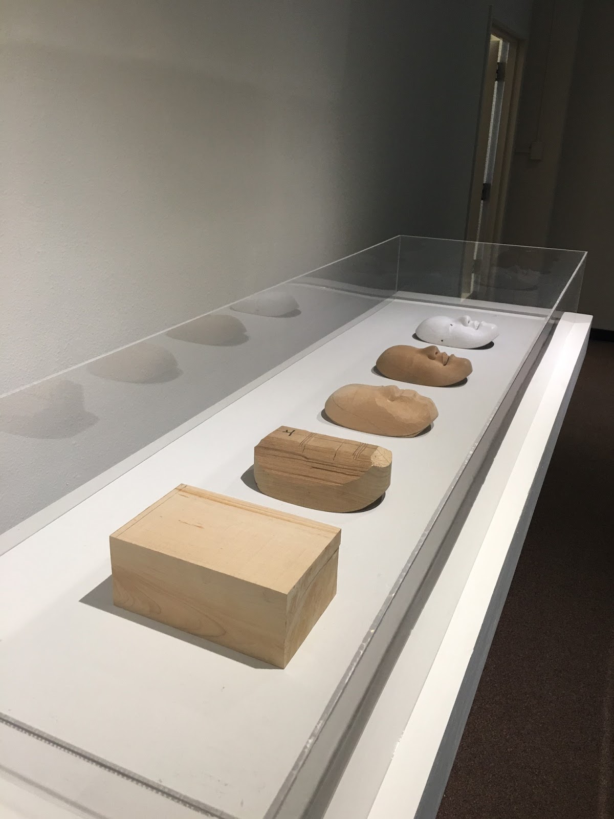
Traditional Noh masks by Bidou Yamaguchi. Photo: Frida Berntson, 04-13-16 

The Japanese Noh theater is a traditional theater in Japanese culture heavy with poem, includes music and dance and the stories are mainly about people seeing and dealing with ghosts from the past. Noh theater has been performed since the 14th century. Traditional costumes are worn by the actors as well as masks; specific masks that have a special look to them. Bidou Yamaguchi is one of few contemporary masters of mask carving in Japan, and he is also a pioneer since he is the first artist to go beyond the traditional norm and create non-traditional Noh masks. His masks are currently on display in the Sac State Library Gallery in the exhibition “Traditions Transfigured – The Noh Masks of Bidou Yamaguchi”, and on April 13 a lecture was held there with the curator Prof. Kendall H. Brown of California State University Long Beach.

Kendall H. Brown speaking, beside him the mask of Mona Lisa. Photo: Frida Berntson, 04-13-16

The curator started the lecture by telling the story of how the exhibition was made, which I thought was interesting. The exhibition was made in collaboration with graduate students at Cal State Long Beach, and the show was specifically done for universities. The exhibition had a lot of different elements like video, sound and an interactive part which the curator explained was the student’s idea. The interactive part consisted of a mirror and “toy” Noh masks that you could handle yourself and maybe take a “selfie”, which the curator thought was very amusing but also a great idea.

Mask depicting Vermeer's Girl with a Pearl Earring by Bidou Yamaguchi. Photo: Frida Berntson, 04-13-16
Mask depicting Munch's Madonna by Bidou Yamaguchi. Photo: Frida Berntson, 04-13-16

The exhibition was done in three parts; the first part with traditional masks and the art that inspired them, the second part with the new non-traditional masks, and the last and third part about the making of the masks. The first part is Yamaguchi’s day job, Brown explained. For several hundred years no new masks were made in Japan, the actors just kept using the traditional old ones. But of course that wasn’t sustainable, so new masks started to be made, and the new carvers copied the old masks. This can seem uncreative and boring to westerners, but Asia has a tradition of copying old masters, as in Chinese landscape painting for example, everyone copying make subtle changes which lead to new ideas. So the new mask artists learned how to age the masks; add little cracks all over the paint and make it look worn where the actors would hold it. So Noh mask carvers are also masters in aging techniques. One important thing that the curator pointed out is that Noh mask makers are not only carvers but also painters, they carve and paint their objects, so it is a truly dynamic work.

The second part of the exhibition was the most exciting with the new non-traditional masks; Bidou Yamaguchi started a series with famous European portraits of women. Masks of Mona Lisa, Botticelli’s Venus, Vermeer’s Girl with a Pearl Earring and Munch’s Madonna were displayed at the exhibition to name a few. When asked why the artist chose this subject the explanation was that he was simply drawn to their faces. These masks are however not simple appropriations; since the Noh play is about ghosts, the masks are considered to express the ghosts of the women, their spirits and their persona. Yamaguchi even re-created all the little oil paint-cracks that most of these paintings have, and according to the curator it took somewhere between eight to nine hours to create! All masks have the sophistication of the traditional ones, and the artist has expertly re-imagined legendary women of art history from 2D to 3D magic.

The process of carving a Noh mask, by Bidou Yamaguchi. Photo: Frida Berntson, 04-13-16

The third and last part of the exhibition was about the making of the masks and also about how the masks appear in different angles and light. Brown explained that the traditional mask “young lady” actually appears to change its expression in different angles and light. There was a video showing this where a robot turned the mask in different ways, and we could all see how the mask turned slightly sad, a little angry, or happy when the smile was accentuated.

The lecture was a very positive experience, the audience walked around in the exhibition and the curator talked about the different parts as we walked through it which is a different format than just sitting down before a slideshow. It is a very good format, it keeps your interest up and you are engaged in the art at the same time you learn everything about it.

The exhibition is on display at Sac State until May 21, 2016.

A video showing the masks from the Sac State Youtube channel.

4.03.2016

Art at Elliott Fouts Gallery

Sacramento has a large number of art galleries across the city, and many of them reside in the lively area of Midtown. Next to downtown, Midtown with its many restaurants, bars and graffiti murals amongst charming wooden houses and lots of trees is a dynamic and interesting neighborhood. No doubt galleries find this area exciting. Elliott Fouts Gallery, one of the galleries in Midtown, opened in 1999 but moved to Midtown in 2012. The gallery specializes in representational landscape and still life painting and has an exhibition space with monthly shows as well as a bigger area for the regular works for sale. Since the gallery was in the midst of changing exhibitions I saw a small portion of Timothy Mulligan’s work that was up in one part of the gallery, and the brand new exhibition of paintings by Lauren Pretorius in the main exhibition space.

Me in front of Timothy Mulligans art. Photo: Virginie, 04-02-16

Timothy Mulligan, Coastal Cliff View, Northern CA, 2015, acrylic on canvas. Photo: Frida Berntson, 04-02-16

Timothy Mulligan, Lake Boats, Tahoe, 2015, acrylic on canvas. Photo: Frida Berntson, 04-02-16

Detail from Timothy Mulligan, Lake Boats, Tahoe, 2015, acrylic on canvas. Photo: Frida Berntson, 04-02-16

Timothy Mulligan, Tiscornia Park, Sacramento, 2015, acrylic on canvas. Photo: Frida Berntson, 04-02-16


Timothy Mulligan’s work is essentially inspired by the French Impressionist movement but with elements of a more expressive style with simplified forms and clear, crisp colors. At first glance Mulligan’s art comes across as very colorful but maybe a little lifeless and overly structured with diagonals and lines crossing perfectly on the canvas. But as you look closely his paintings express a sharp texture that suits very well with the overall style, and the use of different techniques as etching into the wet paint and the absence of visible brushstrokes makes the paintings come together as a whole. Mulligan is a local artist educated at Sacramento State, and his motifs are landscapes around Sacramento and the Bay Area. In Sweden artists paint local landscapes in a very specific way to express the clear and kind of cold Scandinavian light, and to compare that to Mulligan’s warm toned Californian landscape was very interesting.


Lauren Pretorius's exhibition at Elloitt Fouts Gallery. Photo: Frida Berntson, 04-02-16

Lauren Pretorius, Cracked Egg, oil on panel. Photo: Frida Berntson, 04-02-16

Detail of Lauren Pretorius, PB&J Sandwich, oil on panel. Photo: Frida Berntson, 04-02-16

Lauren Pretorius, Spoonful of Honey, oil on panel. Photo: Frida Berntson, 04-02-16

Lauren Pretorius, Fresh Lemonade, oil on panel. Photo; Frida Berntson, 04-02-16


Lauren Pretorius’s show in the exhibition space was very different from Timothy Mulligan’s art. Pretorius’s work is in the still life tradition but with a modern twist with smaller square or rectangular canvases with different objects from everyday life; chopped vegetables, a cracked egg, a glass of lemonade, an onion, an avocado and my favorite – a peanut butter and jelly sandwich. The objects are beautifully modeled in a realistic manner in light and shadow. My initial thoughts from Pretorius’s art was that it is kind of dissecting the mundane in our lives and analyzing the objects we are so familiar with that we don’t notice them. For me as a foreigner some of the paintings made me think of the typical American daily life; especially the paintings with the lemonade, the honey bear, and the peanut butter and jelly sandwich. But for Americans it is probably just a depiction of mundane things.


It is interesting comparing galleries and museums; museums often have an admission fee, but you feel almost always welcome there, at this particular gallery you did not feel welcome at all, even though you didn’t have to pay to see the art. Maybe you could describe this situation as what type of space is welcoming you, a public space or private? 

3.14.2016

Ai Weiwei at the Crocker Museum in Sacramento

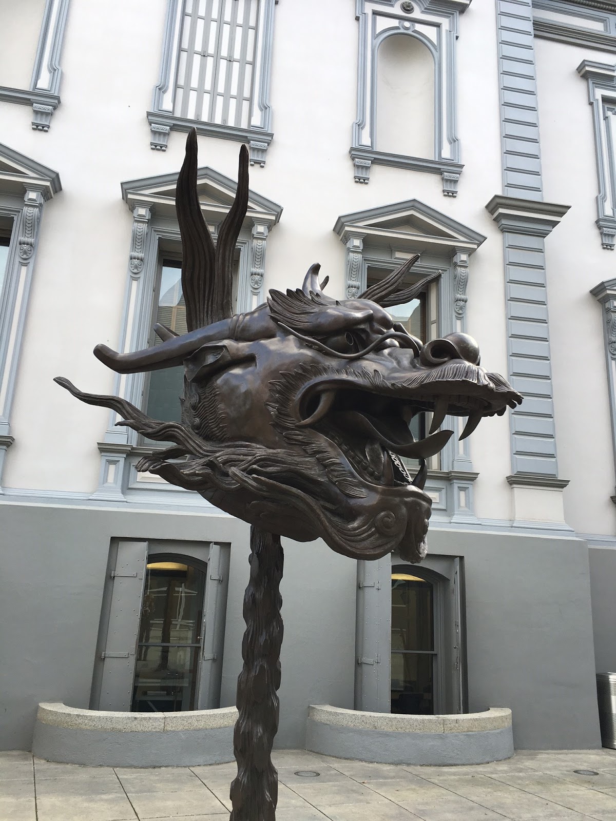
Ai Weiwei, Circle of Animals, Zodiac Heads, bronze, 2010, installation at the Crocker 2016. Photo: Frida Berntson, 03-06-16

Few people interested in the contemporary art world today are unaware of the Chinese artist Ai Weiwei. As an artist, architect, sculptor and activist Ai Weiwei encapsulates the super active media society that we live in today. His political work and gripping installations have made him probably the best known artist of our time, and to see his work on display at the Crocker Museum in Sacramento was truly exciting, almost like seeing a celebrity. The fame of Ai Weiwei makes the experience of his work even more interesting but also problematic; do we see his art differently because he is so critically acclaimed? All his work may not be celebrated, but the large shadow of fame must certainly creep into our conscience as we find ourselves in his art.

Ai Weiwei, Circle of Animals, Zodiac Heads, bronze, 2010, installation at the Crocker 2016. Photo: Frida Berntson, 03-06-16

Ai Weiwei, Circle of Animals, Zodiac Heads, bronze, 2010, installation at the Crocker 2016. Photo: Frida Berntson, 03-06-16

The Crocker is showing Ai Weiwei’s installation Circle of Animals, Zodiac Heads right now until May 1, 2016. The artwork consists of the twelve Chinese zodiac animals' heads cast in bronze in an oversized scale. They stand in a circle just outside the entrance at the Crocker, looming before anyone who stands before them. The size of the heads gives a massive impression, but each one is sculpted differently. Some of them look rather naïve, especially the rabbit and monkey. The ram, rooster and dog are on the other hand sculpted very naturalistically, some even with fine veins on the surface of the heavy bronze. Some of the animals are stylized; the tiger and especially the dragon. The dragon catches your eye fast, because of its specifically Chinese style, it is as if it screams for attention… or it might just be different from the other ones.

Ai Weiwei, Circle of Animals, Zodiac Heads, bronze, 2010, installation at the Crocker 2016. Photo: Frida Berntson, 03-06-16

Ai Weiwei, Detail of Circle of Animals, Zodiac Heads, bronze, 2010, installation at the Crocker 2016. Photo: Frida Berntson, 03-06-16

There is no doubt that this work draws attention to Chinese history, art and Chinese identity, topics that Ai Weiwei has touched on many times. The heads are actually inspired by the twelve zodiac animal heads that adorned the 18th century fountain-clock of the Yuanming Yuan; an imperial retreat close to Beijing. The Yuanming Yuan was sacked by French and British troops in 1860 and the heads were lost. Ai Weiwei’s contemporary recreation of the heads can be interpreted as a sort of ceremonial repatriation. One could think that the culture of China is more and more westernized each year with the expanding economy and sort of western way of society spreading throughout the country. Maybe Ai Weiwei is reacting to change in his artwork or questioning the establishment? Maybe the dragon represents traditional Chinese culture; a large shadow over the other animals and a bit lonely. The artist is above all reflecting over what it means to be Chinese today, in recreating an old legend in this specific way.

Me in front of Ai Weiwei's Circle of Animals, Zodiac Heads, bronze, 2010, installation at the Crocker 2016. Photo: Virginie, 03-06-16

The exhibition was a good experience and I think the Crocker had done a nice job in how to complement the monumental bronze heads. They had a good text next to the objects, not too long and not too short. The text was also friendly to people that may not have been familiar with Ai Weiwei, which is nice in terms of participation. There was a bigger room and area with more information inside the museum, and sometimes too much context can ruin an art experience but I think it really fitted well here. A weakness in the exhibition is that it is spread out at the museum; it was hard finding the way to the additional information area and without exploring through the museum it can easily be missed. Maybe this is not Ai Weiwei’s most jaw dropping or loud artwork, but it has other qualities; it is a quiet ponder about China, its people and fast-forward change.


Information about the exhibition on the Crocker website click here

3.05.2016

Pump up the volume! – review of the exhibition with artists Joe Lewis and Jane Dickson

A couple of weeks ago I wrote about the exciting artists’ talk that was held at Sac State with artists Joe Lewis and Jane Dickson as a part of their exhibition “Pump up the Volume!”, and it is time to talk about their exhibition more closely, even though I am a little late to the party!

If you read my post about the artists’ talk you know the background of Jane Dickson and Joe Lewis, but if you haven’t I will briefly go through their background. Both artists were a part of the famous art organization Fashion Moda in the Bronx in the 1970’s and 1980’s. They worked in new materials and collaborated with graffiti artists for example, they were the pioneers of new art at the time.

Me in front of the title by Joe Lewis and Jane Dickson, at Else Gallery, 02-23-2016
At the opening of the exhibition on January 27, 2016. Photo: Frida Berntson, 01-27-2016

In the foreground Joe Lewis' “UNITY…Who you calling a bitch?”, Epson UltraChrome K3 ink on Kodak Endura Paper, unique, 2015. Photo: Frida Berntson 01-27-2016


In the exhibition at Else Gallery Joe Lewis and Jane Dickson showed a variety of different works, and all of them connected in some way with early hip hop culture, which they both experienced in the Bronx. Early hip hop was playing in the gallery and set a perfect atmosphere and mixed well with the art, which was very varied; paintings, installations, prints and collages. One of my favorite works was Joe Lewis’ “UNITY…Who you calling a bitch?” from 2015. In this digital collage print we see the classical Nefertiti bust besides a wall of boom boxes, and then the best part; a “Hello my name is” sticker but with the text “who you calling a bitch”, put directly on the print. I thought the work was very funny but also a bit political with the classical Nefertiti. It made me think of African American culture, how it has changed and what it means. The Nefertiti bust has always been an art historical ideal, but here she has more of a personality and attitude!

Joe Lewis, The Word, 2010 with visitors in the background. Photo: Frida Berntson 01-27-2016


Jane Dickson had a lot of portraiture in her sketchy and full painting style, which I thought suited well with the hip hop theme. Another of my favorite works was Joe Lewis’ “The Word”, an installation piece set up in the middle of the gallery. It consisted of a table with a white linen cloth and a large open book on top of it, on the page was “THE N WORD” typed, and in front of the table a music-stand. This work made me think of a lot of things and I thought it was remarkable. The thing I remember the most was that I thought it had a lot to do with power, who has the right to speak, to learn, to be educated? And I of course thought about the power of that specific word, where is it now and will it sometime be forgotten?

The exhibition had little or no weaknesses in my opinion; it was very well put together and the relaxed atmosphere made the exhibition less formal. The show was dynamic, interesting, exciting, funny and serious; a nearly perfect display.

Left: Joe Lewis, The Message, Epson UltraChrome K3 ink on Hahnemühle paper, Edition of 3, 2015, right: Jane Dickson, B-Boy Head Spin 1-3, oil on rolotex on canvas, 2016. Photo: Frida Berntson 02-23-2016


2.21.2016

Nurture by Linda Vang – student art exhibition at Sac State

It is always fun and interesting to see art student’s works of art, not only because they often experiment with different media but also that you might detect a forthcoming trend! Art major Linda Vang, a student at Sac State, is currently having an exhibition in the Witt Gallery at Sac State, and her works are mostly about exploring and capturing organic forms and connecting the aesthetics with her cultural heritage. Vang also explores the often elusive line between nature and culture in her work.

Linda Vang, "Set 5 Study", oil on panel, 2015. At Witt Gallery. Photo: Frida Berntson, 2016-02-17


In the artistic world of Linda Vang I think of fantasy, saga and an otherworldly forest land. One of her works, called “Set 5 Study” made in the spring of 2015 draws a lot on organic natural forms and also color schemes that seem influenced by seasons or feelings. The four smaller sized oil paintings were made on a raw wood panel, and keeping the wood natural enhanced the natural vibe and added a new texture to the art which made it more interesting. Vang’s brushstrokes are both heavy, full of texture and delicate; making the organic forms come forward even more.

Linda Vang, "Large Study 1", oil on canvas, 2015. At Witt Gallery. Photo: Frida Berntson, 2016-02-17


The exhibition also showed a number of larger oil paintings, like “Large Study 1”, made in the fall of 2015. This painting made me think of Tim Burton’s Alice in Wonderland and fantasy video games; a play with organic forms with rich otherworldly colors. The motif almost looks like a utopian rainforest grove where some kind of scene could take place. The mixed color scheme of this artwork made it more engaging than for example the set studies, which mostly each had a homogeneous color scheme. The homogeneous colors made paintings like the ones in “Set 4 Study” harmonious and calming, especially the one with a mix of pinky mauves, dark purple, gray and a hint of green. The smaller paintings almost felt like if a rococo painting was mixed with fantasy art.


Linda Vang, "Set 4 Study", oil on canvas panel, 2015. At Witt Gallery. Photo: Frida Berntson, 2016-02-17
Linda Vang, detail of "Set 4 Study", oil on canvas panel, 2015. At Witt Gallery. Photo: Frida Berntson, 2016-02-17

The Witt Gallery at Sac State is a small but nice gallery, with white walls and a stone floor. I think it suits student art shows well, or an exhibition with fewer works. A weakness in Vang’s exhibition is that most works are very much alike, and isn’t that engaging. The works are pretty to look at and makes you think, but they don’t make you think as much as art maybe should. But who really decides what art should or shouldn’t be? In conclusion is Linda Vang’s exhibition “Nurture” a very well put together art show with a couple of recent works by the student. Her work makes you wonder about nature and organic forms that surround us all the time, but mostly it makes us enjoy the art of oil painting, the texture and the feeling of the materials which play into the organic vibe.

Me in front of Linda Vang's "Set 4 Study", at Witt Gallery. Photo: Linda Vang, 2016-02-17

2.11.2016

Art Hotel - A temporary art space in downtown Sacramento

The entrance to Art Hotel, Sacramento

On 7th and L Streets in downtown Sacramento there is an abandoned hotel and apartment building set to be demolished in the spring of 2016. Before the building meets its fate 30 artists from around the globe decided to take over the building and make it into a very special art experience! The artists transformed the hallways, kitchens, rooms and restrooms of the building and created a multifaceted art exhibition that most of all encourages the viewer to explore.

A long line of people had already formed at around 12.00 on Saturday February 6th when the exhibition was about to open its second day. Since I’m always curious about representation and participation due to my studies in cultural science I found it interesting and uplifting that even families with young children, younger couples, elder art fanatics and groups of friends were all there for this special event. It reminded me once more of how important art is in our lives and how many people actually love experiencing art!

When my friends and I got into the exhibition we had to walk through a sort of plastic thick drapery that guided us to the second floor, it felt a little bit like being transported to a different reality; Narnia-ish! The second floor and the whole building was packed with murals, sculptures and installations in different mediums and media. Art was everywhere! The artists had planned it out so that each artist had approximately one room to do what they wanted with. The art in the rooms consisted of traditional hangings on the walls, a lot of graffiti art and murals, installations with soundtracks and skateboarding, photographs, video art as well as political art pieces and so much more! One thing that I thought was interesting was that some objects like stoves and fridges were left in the building and became a part of the art and also created a different atmosphere; since there is not normally fridges and stoves in the white cube of the art gallery!

Dave DeCamilla, "Just in Case Case", enamel on wood and toy gun

Kitchen by artist Jose Di Gregorio


I had many favorite rooms of the art space and one of them was the room that artist Nina Jean Lynch had made. Working in mostly ceramics she creates objects that hint to popular culture and kitsch, and she also has an animal and natural theme to her art. Her art was in one of the kitchens, which suited very well. The shelves were packed with small animal bones and on the walls hung animal furs which came across as very unnerving and awkward in the kitchen. On another shelf was ceramic kitschy food tins placed as well as ceramic bananas, and on the fridge were magnets with the texts “beware of pseudoscience” and “little did they know”; making at least me think of the animal rights movement. Ceramic hens were placed out on some hay behind wire in another part of the kitchen, on the wire was a sign; “QUARANTINE bird flu”, making it somewhat naïve and funny but also serious. The two objects that most people took photographs of were two salt and pepper-ish containers in ceramic on the stove, but the text on them read “salt” and “anti-salt”. The whole kitchen was like a clever mix of black humor, political seriousness and utter weirdness, making it a very memorable experience!


Kitchen done by Nina Jean Lynch


After the exhibition you felt very uplifted and inspired, mostly because of the blitz of creativeness that had just washed over you but also the overall spontaneous feeling of the art. Contemporary art really has so much to offer. And the fact that every room was so different kept your imagination up, the exhibit had something for everyone. A truly remarkable experience.

My friend Tone doing a beautiful sketch in one of the interactive rooms.


If you’re in the Sacramento area I highly suggest that you visit the Art Hotel before it shuts down for good on February 13! If you’re curious why not visit their website at http://m5arts.com/ or check out the hashtag #arthotel916 on Instagram where many visitors have posted pictures and videos!

All photos are taken by me.